

Problem
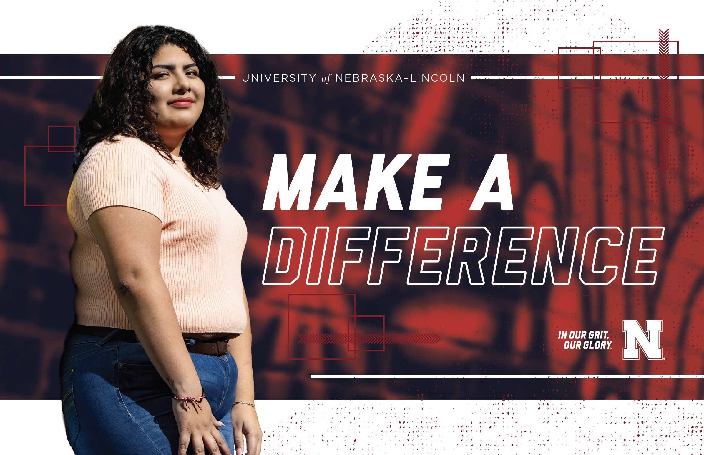
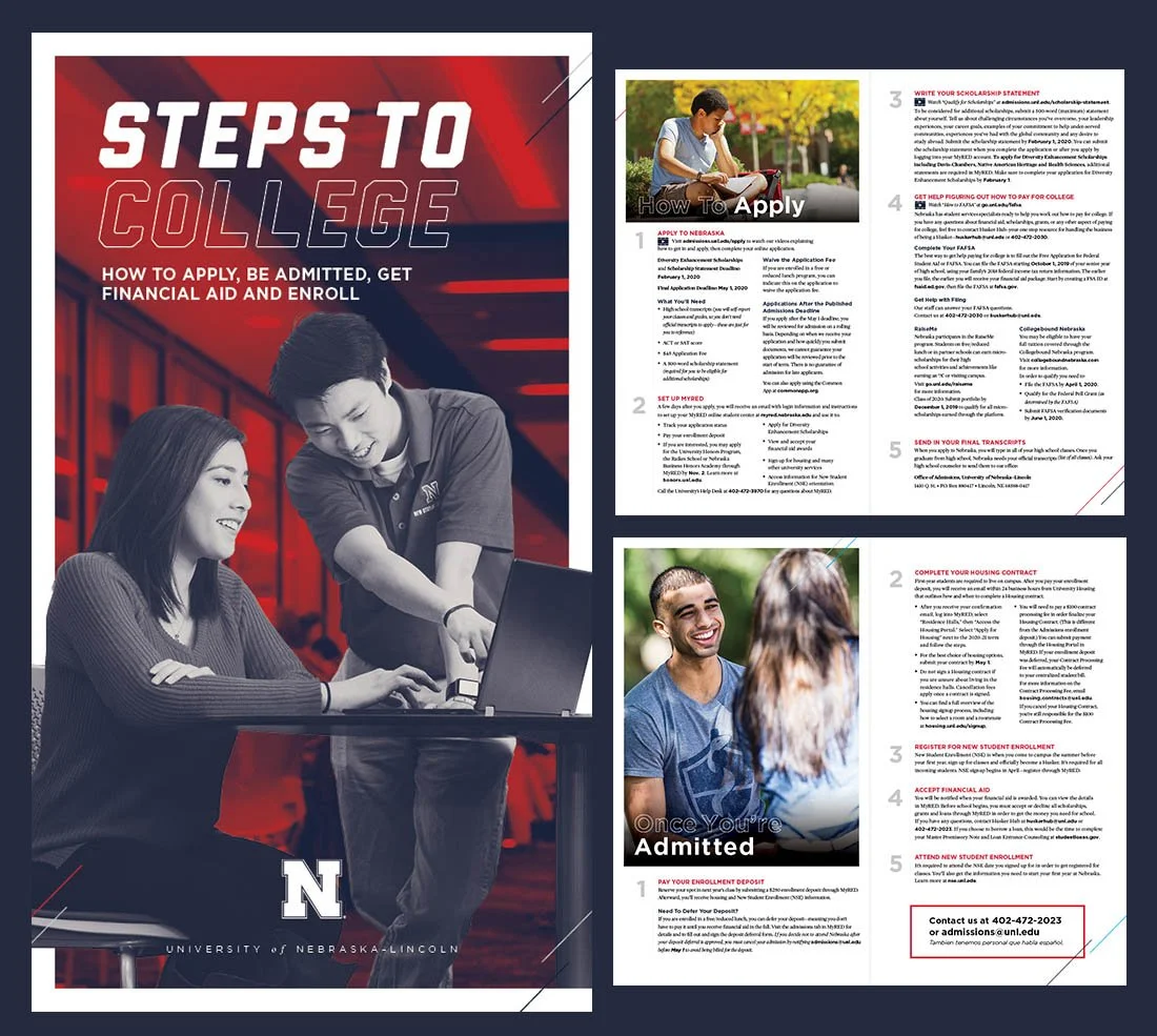
The existing visual style for the University of Nebraska–Lincoln had been in use for several years and was beginning to feel dated to current students. Some students strongly associated the look with the COVID-era campus experience, while others felt the heavy use of duotone imagery came across as impersonal. In many cases, the effect made photography feel more like a background texture than a meaningful image, reducing the emotional connection to the content.
The challenge was to refresh the visual system in a way that felt warmer, more engaging, and more current while still staying within the University’s established brand standards.



Process
I led a small design team alongside two junior designers to explore ways the University’s visual identity could evolve while remaining recognizable and aligned with existing branding guidelines.
Our process included researching successful visual systems from sports brands, editorial design, and current higher education trends. We also revisited the University’s historical brand materials to better understand elements that had been lost over time.
One key discovery was the stronger use of cream tones in older University materials. While recent designs had primarily relied on red, white, and navy, we decided to reintroduce cream accents to add warmth and create a more inviting editorial feel, especially across magazine spreads and print layouts.
We also simplified the overall visual system by reducing excessive textures and graphic overlays that had made layouts feel crowded. Photography became a larger focus, with full-color imagery replacing the previous duotone treatment. This helped create a more authentic and personal connection to student stories, campus life, and University experiences.
Throughout the process, I worked closely with the team to refine layouts, establish clearer visual hierarchy, and ensure the updated direction could scale across multiple print and digital applications.
Outcome
The refreshed visual identity created a cleaner, warmer, and more approachable look for University communications. By simplifying layouts and allowing photography to feel more natural and human, the materials became easier to engage with while still delivering the same core information.
The updated direction was viewed more favorably internally and helped modernize the University’s visual presence without abandoning its established identity. Print pieces felt less busy, imagery felt more authentic, and the system provided greater flexibility for future campaigns and publications.
During this period, University enrollment numbers also remained strong, reinforcing the success of maintaining a recognizable brand while evolving its presentation for a new generation of students.
